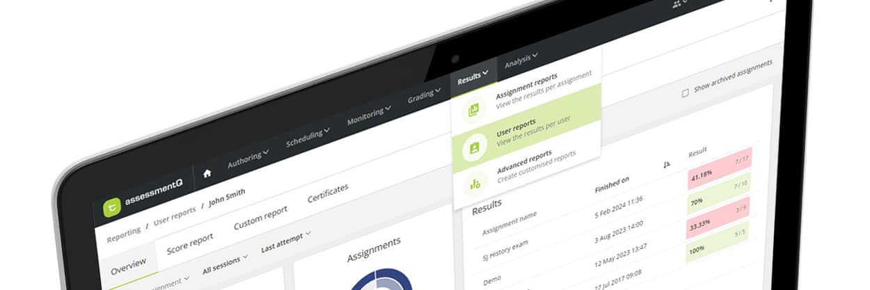
assessmentQ boosts user experience with a fresh menu structure
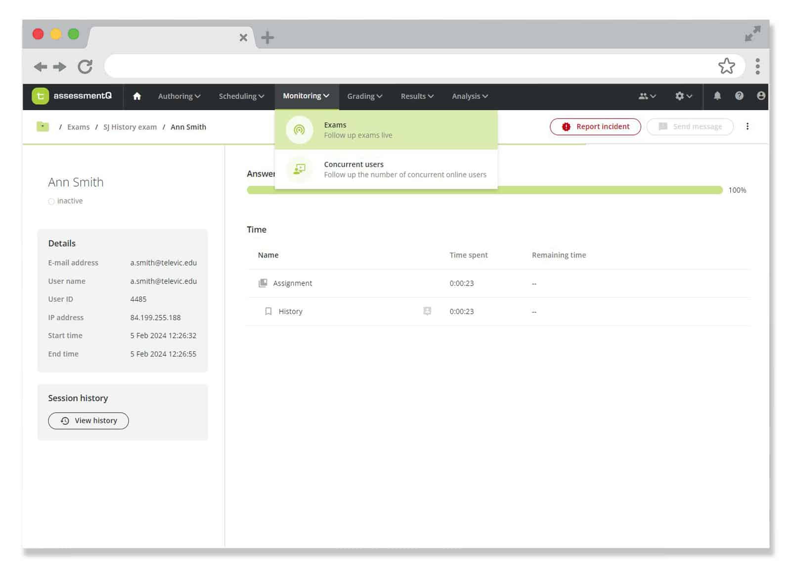
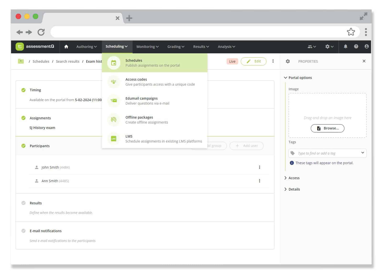
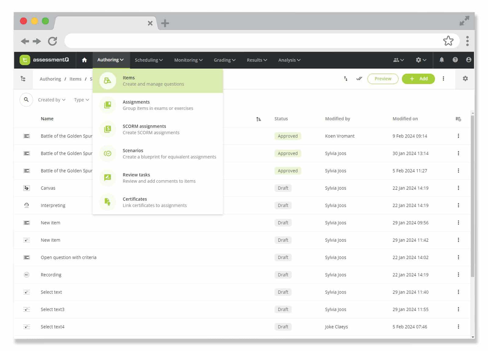
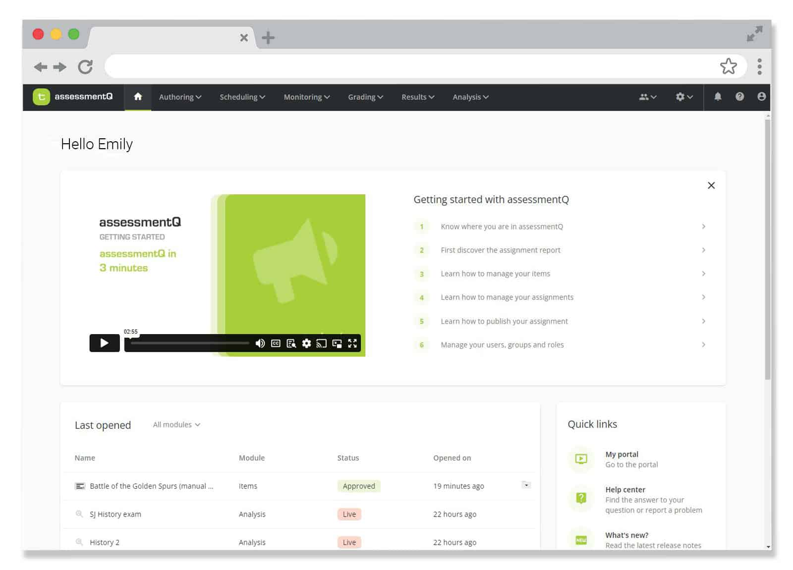
With the latest upgrade to the assessmentQ exam platform comes a compelling overhaul of the platform’s user interface and menu structure. This new design introduces a new level of simplicity and effectiveness, intended to bring a more streamlined and pleasant experience to assessmentQ users.
What’s new?
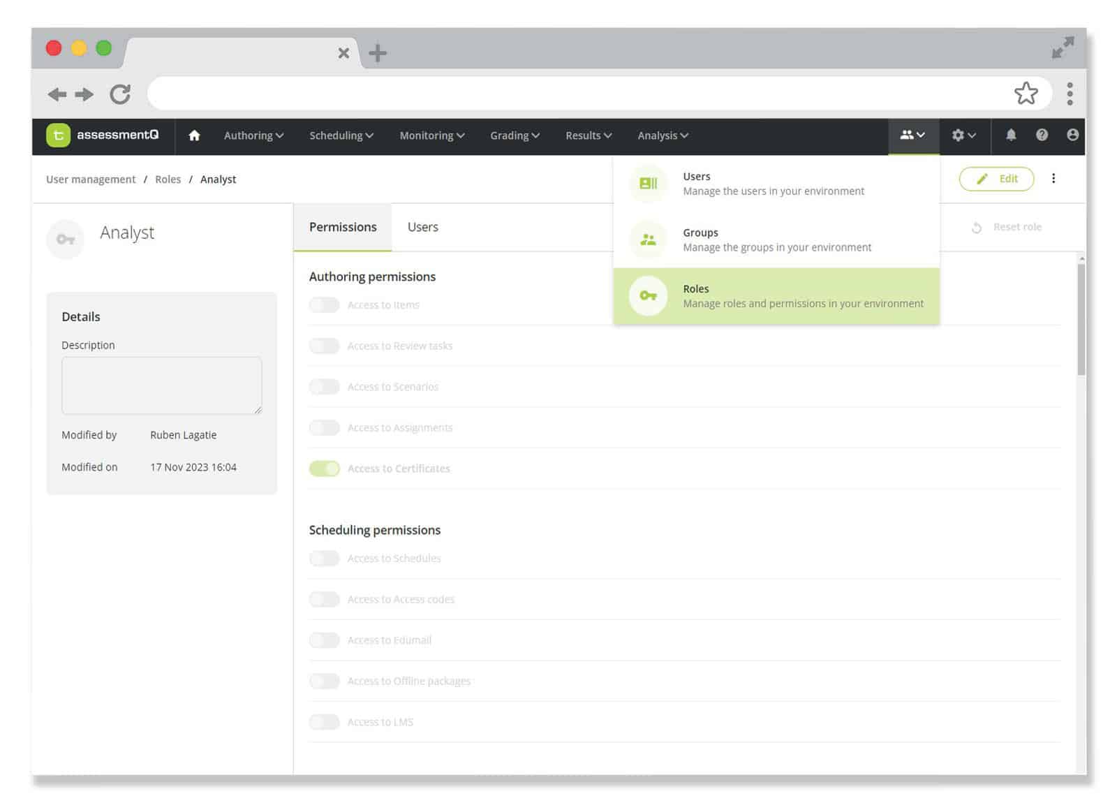
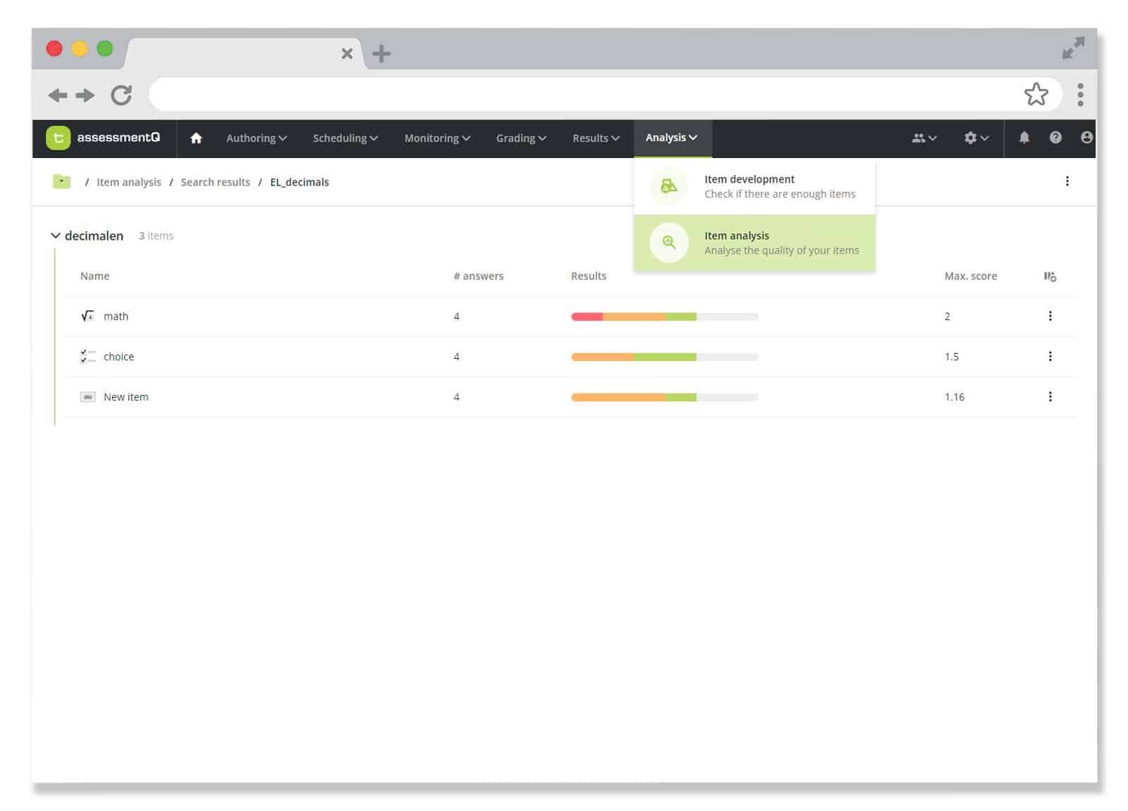
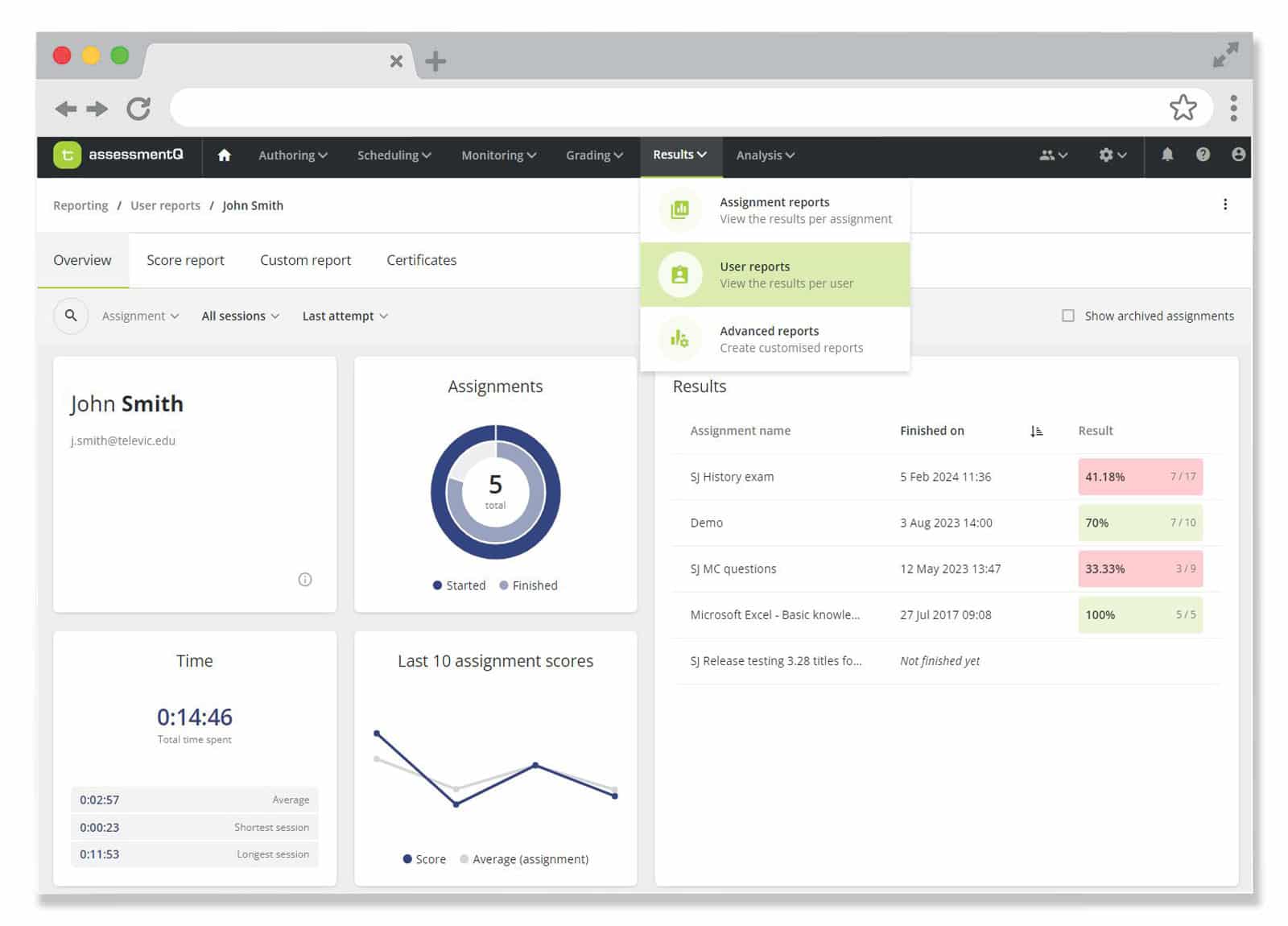
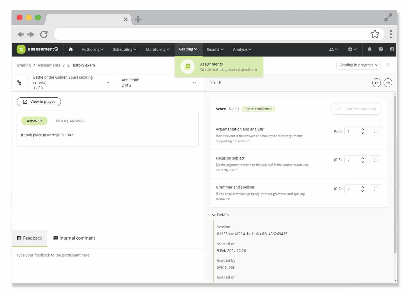
Goodbye left-side menu. Welcome top navigation. A redesign that isn’t just about aesthetics, but also about streamlining the assessment process, ensuring that every step – from authoring to in-depth analysis – is more seamless, more logical, and more intuitive.
Why these changes?
Better guidance
The new menu structure acts as a compass through the e-assessment process. With clear, logical categorization and simple icons, you’ll always know where you are and what your next step should be.
Easy access
Accessing important platform settings becomes a lot easier thanks to the easy-to-reach settings menu in the top right corner. Need to edit configurations or personalize your experience? It’s just one click away.
Stylish & modern
User experience should be both functional and visually pleasing. That’s why our user interface not only enhances usability but also adds a touch of modernity, freshness, and sophistication to your work.
Enhanced efficiency
We’re confident that this UX changes will elevate users’ productivity, efficiency, and overall satisfaction with assessmentQ. Both seasoned and new users will feel that every aspect of assessmentQ has been developed with their needs in mind.
Experience the difference for yourself. Login or start your free trial right now.


